Design Challenge
Games.disney.com is a pre-existing section on the Disney.com website. I was asked to revisit the design of the mobile games pages, do a heuristic evaluation and make design improvements for the Mobile Network Team when they took responsibility of these pages. I had three primary objectives — redesign the existing page format, make the pages responsive – viewable on any device; and drive more app downloads. I was tasked to deliver wireframes mockups and final art assets for Web, iOS, Android and Windows.
My Role
I was responsible for the UX strategy and design of the Disney mobile landing pages. I lead the Art and UX work, producing art assets and presenting the work to the stakeholders for review and approval. I worked with the PM, HTML developer and the Head of Engineering to understand the underlying tech. I analyzed the landing page and interviewed gamers to understand what triggers them to download games. Taking a Gamer friendly approach, I crafted personas to design landing pages that would increase downloads.
Vision & UX Strategy
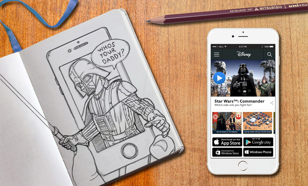
First I talked with real gamers, then I created sketches and wireframes to share the vision, design principles and page content strategy. The wireframes helped to evangelize design ideas, gain alignment and drive decision making forward into mockups.
Planning & Scope
I partnered with the Product Manager to define the specs which evangelized a gamer centric User Experience. I took the proposal to engineering for negotiation and we planned to carefully evolve the product and craft a better user experience.
Oversight
I designed across and collaborated with both HTML developers and backend engineers. I lead the product to ensure coordination, translate ideas and visually QA all the product features for all the various platforms.
Leadership
I presented design ideas to gain buy‐in from PMs, developers, engineering and other Disney teams. I evangelized the benefits of User centric design, knowing the user and designing things specifically for them based on their desires and their behaviors.
Personas
Understanding what triggers gamers to download a game
Q: Why create personas?
A: Because you are not your user
Personas are fictional, generalized characters that encompass the various needs, goals, and observed behavior patterns among your real and potential customers. They help you know your customers better. I used personas in this case to better understand what gamers needed to see in order to download a game.
John – 36
User Type: Whale
Plays games on iPhone/iPad/Laptop
Plays with friends on Facebook, iOS, PS3
He buys console games and pays to play his favorite freemium games, usually it’s accessories for avatars or weapons/upgrades for game characters. He likes fighting games and strategy games.
He’s not into Disney titles, but is a big Star Wars and Marvel fan loves Marvel Avenger’s Alliance.
Han – 29
User Type: Whale
Plays games on iPhone/iPad/Laptop/PS3
Plays with friends on Facebook, iOS, PS3
He plays console games and iOS freemium games, he pays to play games getting accessories and additional avatars and weapons/upgrades for his characters.
He loves Star Wars games and Super Hero Games. He’s likes some Disney titles, like Tron, but is a Super Star Wars fan.
LaRae – 42
User Type: Whale
Plays games on iPad/Laptop/Console
Plays with friends on Facebook, iOS,
She plays console games with kids and iOS freemium games, she pays to advance in puzzle games, accessories and clothes for her avatars.
She loves Star Wars, Fashion and Puzzle Games. She loves Disney titles, Princess Movies but is a Star Wars Super fan. She loves Princess Leia
Deanna – 39
User Type: Social Viralizer
Plays games on iPad/Laptop/Console
Plays with friends on Facebook, iOS,
She plays console games with friends and some iOS freemium games.
She loves Star Wars, and Assassin’s Creed. She’s not a huge fan of Disney titles or Princess Films, but is a Star Wars fan. Likes certain Marvel Heroines, she loves the Avengers movies and has played Marvel Avenger’s Alliance.
What triggers you to download a game?
User Study:
All users considered themselves Mid-Core Players and played games like League of Legends, Star Wars Commander, Marvel Avengers Alliance, Clash of Clans, Assassin’s Creed, WOW etc…
Participants:
8 men, 7 women, ages ranged between 18-40. All people interviewed accessed their favorite game via iPhones, iPads, Laptops and consoles. All interviewees were familiar with apps, and had played mobile games before.
- I want to see a user game play trailer – not the official game trailer 100%
- I want to see a series of screenshots from the actual game 100%
- I want to see game reviews from actual players playing the game 100%
- I want to see game reviews from game review sites 90%
- I want to see the official game trailer 75%
My Design Process
Re-structuring existing content to create products customers actually want
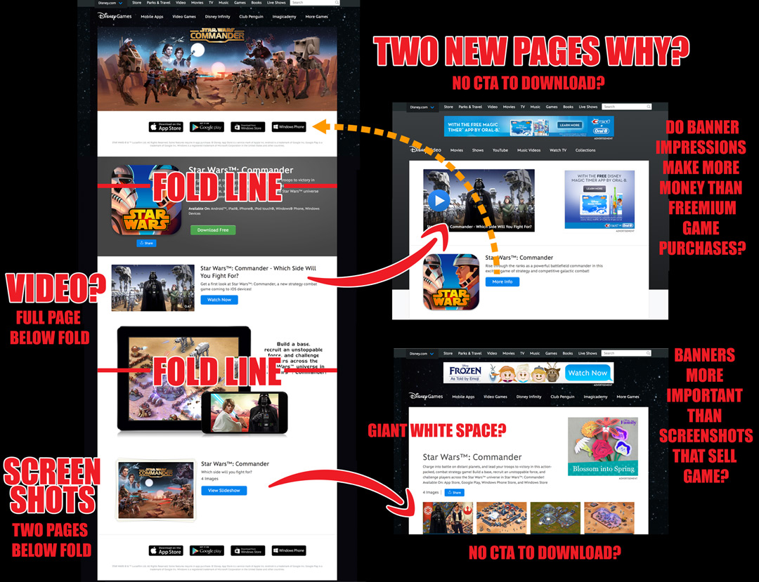
Before starting any design work, I spent time reading through user feedback and completed a competitive analysis. Then I looked at our existing page flow and tried to make sense of it. What users wanted and what existed on Disney.com were two completely different things. Our pages were highly unusable, driving users back and forth between pages like a ping pong ball to see game trailers, screenshots and access to download buttons. We were making it unnecessarily difficult for users to download our apps.
Game Trailer
Users said the most important thing for them to see in order to trigger a download was a game play trailer. We had a game trailer BUT it appeared to be 1 1/2 pages below the fold. In reality when you clicked the “watch now” button it actually directed you to a new page where you had to click the video player all over again to actually view it. If you’re saying WHAT!?! WHY!?! – You’re not alone.
Screenshots
Users said the second most important thing for them to see in order to trigger a download was actual game art. They wanted to see screenshots of the actual game to see if it was something they were attracted to and interested in playing. Our screenshots were three pages below the fold and lead to a different page. When you landed on that page the screenshots were partially below the fold.

Wireframing
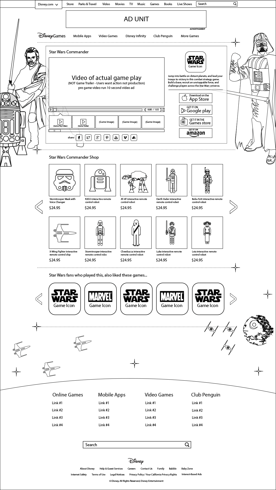
This is the first pass wireframe for the Star Wars Commander Landing page. This was specifically designed using feedback from our Mid-Core Star Wars players 18-40 years of age. Since I knew what our gamers were after, I jumped straight into wireframing, to redesign the flow, remove unneeded pages, and restucture elements on the page putting things where users expected to find them and adhering to standard best web practices.
The All New Content Module
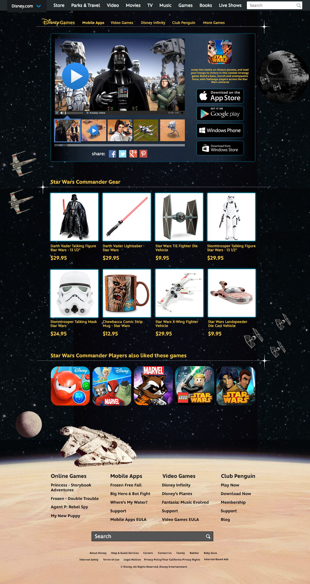
I put all the important items users said they needed to see to trigger a download above the fold in a newly designed media module. It contained a brief game description, a game play trailer, the official game trailer, and multiple game screenshots. I also grouped all the various platform download buttons in the module, and enabled users to share our content with their friends via popular social media sites.
New Monetization
Since I removed two pages with banner impressions. I felt the need to replace that revenue stream with something else. Less than 10% of freemium game players convert and pay to play means that 90% of players aren’t spending on the game. I know they liked Star Wars, a quick look at the Disney Store turned up tons of Star Wars products. I suggested we take a slice of the Disney Store and add relevant targeted items here.

Look & Feel – Your brand is your mark of distinction
Your brand/look & Feel is what sets you apart from your competitors. It’s critical to establish brand consistency across all your assets. A good example of this strategy is UPS. Most delivery companies’ color palettes are bright. UPS on the other hand is brown. They own brown in their category so much so that their color icon has become their slogan – ‘What can brown do for you today?’
Before the redesign the pages did not feel very Star Wars and they were put together hapharardly. They didn’t hold up to the quality of Disney or Star Wars in my opinion. I changed that.

